3 Why Would We Think About Using R?
The benefits of creating maps using a programming language.

It’s true there are many programmes out there which let you build maps. These can be everything from image editors like Photoshop, to proprietary GIS software like ARCGIS. Using a programming language offers a number of advantages in some situations.
3.1 Open source
This is the main benefit. R is Free, when you leave your institution you will still be able to use it without a license.
The language is also ever expanding, and there is tonnes of help online which you don’t just get in a manual. Look on Twitter for #Rspatial. Whenever someone writes code that has wider use, it’s likely they will write it into a package. Below I’ve listed some really helpful ones you may want to look into for making maps and using spatial data.
- raster
- terra
- sf
- stars
- rayshader
3.2 Reproducibility
Code is key to reproducible (and repeatable science). It’s hard to document which button you clicked on, but code is always there to come back to.
This also means if you ever want to tweak something you can just change one line in the code, instead of having to manually change elements.
It also means once you’ve figured out a task once, it’s very fast to do the same thing again for different locations.
3.3 Geocomputation
Unlike in an image editor, you can perform further calculations. Your data may be of a different type to the data visualistion you had in mind. This might be a problem if you were creating your map in photoshop or cough powerpoint, but with R you can perform a variety of spatial calculations to create new objects to plot. You can either cast the data into a new type, point ⇢ line ⇢ polygon, or summarise your data into a new object for mapping, perhaps a raster. I’ve given a few examples of what’s possible below, but Google is your friend (and stack overflow) for finding new and exciting options.
3.3.0.1 Contours
rasters ⇢ lines or polygons
You may have a raster containing a lot of information, but want to combine the information with other data layers. To avoid things getting too busy you can reduce the raster to contour lines. These show the boundaries for areas contained within a particular value. Think of contour lines for elevation on an ordinance survey map. The example below gets contour lines from the distance to shore data.
# Contour example raster

library(sdmpredictors)                                                 # Load functions

distance_to_shore <- load_layers("MS_biogeo05_dist_shore_5m") %>%      # Import raster
  subset(1)                                                            # This is just some data cleaning

ne_atlantic_ext <- extent(-100, 45, 30.75, 72.5)                       # Define a cropping window
distance_to_shore_crop <- crop(distance_to_shore, ne_atlantic_ext)     # Crop raster to fit the North Atlantic
contour <- rasterToContour(distance_to_shore_crop)                     # Calculate contours

my_colors = colorRampPalette(c("#5E85B8","#EDF0C0","#C13127"))         # Get a colour ramp
plot(distance_to_shore_crop, col = my_colors(1000), axes=FALSE, box=FALSE) # Plot the raster
plot(contour, add = TRUE)                                              # Add contour lines
title(cex.sub = 1.25, sub = "Distance from shore (km), with contours", # Add labels
        line = -1.5)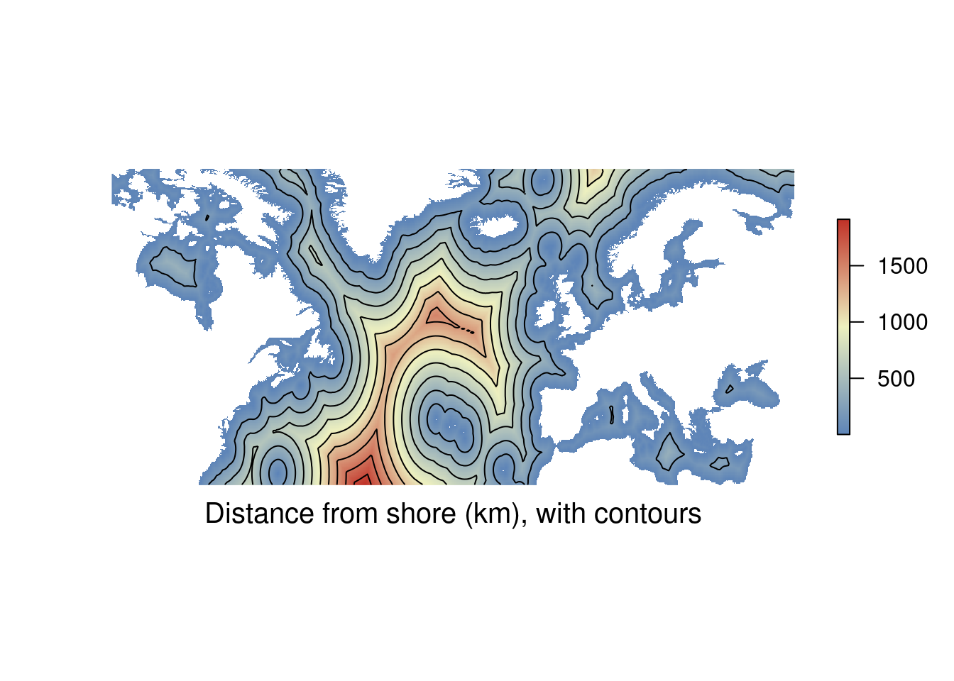
3.3.0.2 Density maps
points ⇢ lines or polygons
You can think of density maps as being closely related to contour plots. Really what you are doing is creating contours (filled = polygons, not filed = lines) of a density field. The density field will be a raster which has been computed from point data. So you can see how to get to a density map you need to move from points through multiple data types to get to the visualisation you’re after. The example below calculates the density of lifeboat stations.
RNLI <- read.csv("./Data/RNLI.csv")                               # Import the lifeboat station positions

ggplot(RNLI, aes(X, Y)) +                                          # Start the plot, specifying x and y column
  geom_density2d_filled() +                                        # Add a filled density field
  geom_point(colour = "black", fill = "white", shape = 21) +       # Add the points on top
  theme_minimal() +                                                # Use and aesthetic template
  coord_equal() +                                                  # Set the aspect ratio
  labs(x = "Longitude (E)", y = "Latitude (N)",                    # Add labels
       fill = "Density",
       caption = "Lifebat stations around the UK and Ireland")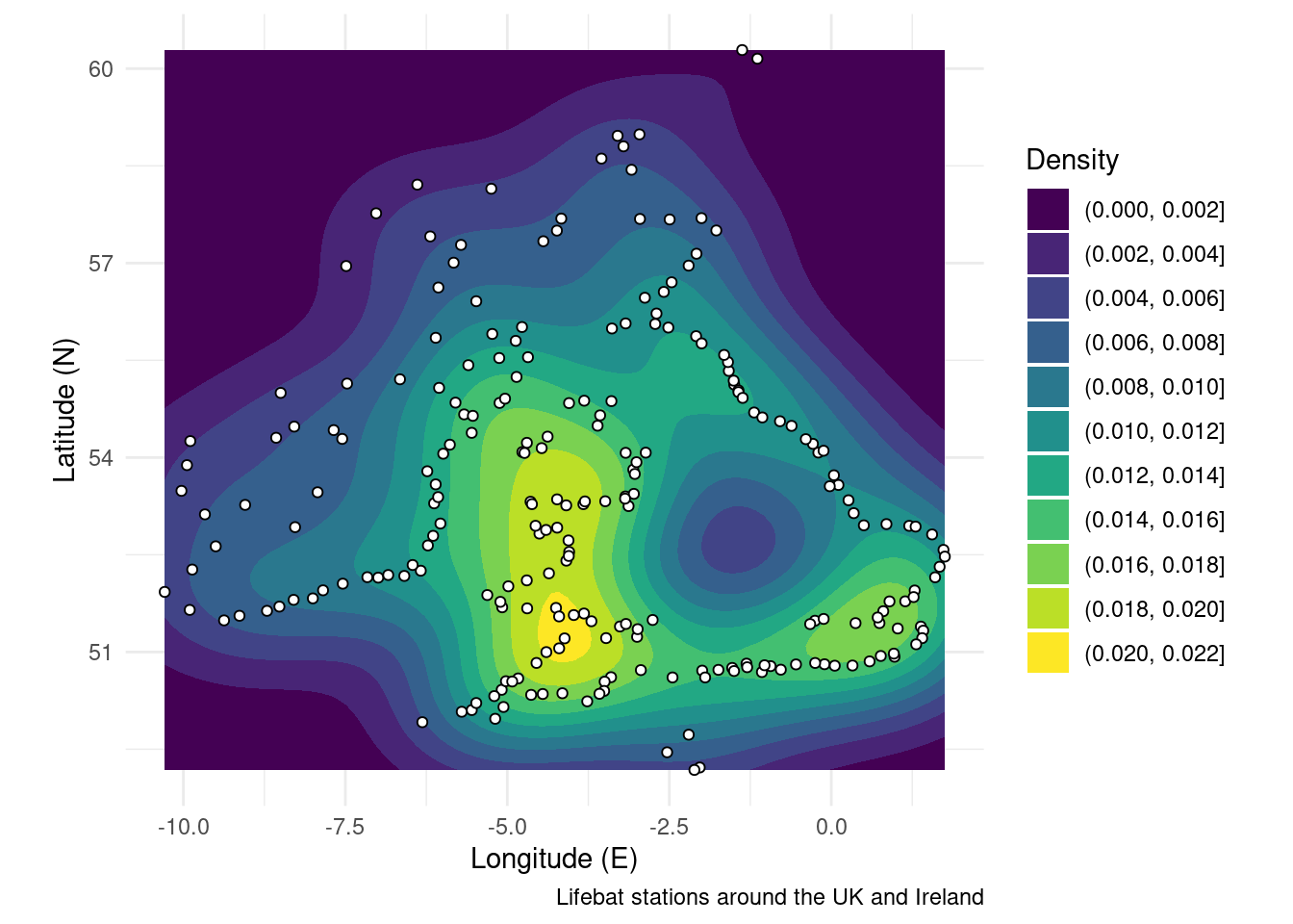
The next code chunk creates the same figure, but uses a slightly different syntax to play nicely with SF objects. The main advantage is that you can easily change map projections and the density field is measured in “real space.” See the section on map projections for more details.
RNLI <- read.csv("./Data/RNLI.csv") %>%                   # Import the points again
  sf::st_as_sf(coords = c("X", "Y"), crs = 4326) %>%       # Convert to sf points using the x and y column as coordinates
  sf::st_transform(crs = 3035)                             # Use a different map projection

ggplot(RNLI) +                                             # Start the plot
   stat_density_2d_filled(mapping = ggplot2::aes(x = purrr::map_dbl(geometry, ~.[1]), # Calculate density from the sf object
                                          y = purrr::map_dbl(geometry, ~.[2]))) +
  geom_sf(fill = "white", colour = "black", shape = 21) +  # Add the points on top
  theme_minimal() +                                        # Use an aesthetic template
  labs(x = "Longitude (E)", y = "Latitude (N)",            # Add labels
       fill = "Density",
       caption = "Lifebat stations around the UK and Ireland")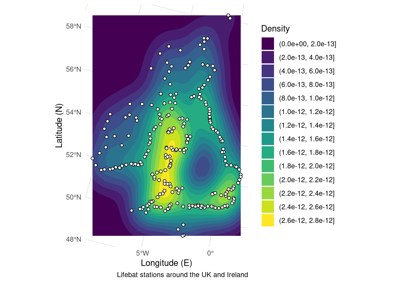
3.3.0.3 Point in polygon analysis
polygons ⇢ to points
There may be times when you want to join polygon attributes (fishing area or habitat types) to points or grid cells (animal tracker pings or climate predictions). The way to do this is to perform a spatial join.
In the example below I’m showing the ICES fishing areas a boat passes through. To do this we sample the polygons at points along the longest boat journey from the shipping dataset.
ICES <- sf::st_read("./Data/ICES_areas/", quiet = TRUE) %>%                 # Import the polygons from a shapefile
  filter(SUBOCEAN == 2) %>%                                                  # Limit to north Atlantic
  drop_na(F_SUBAREA)                                                         # Drop polygons labelled NA

Boats <- sf::st_read("./Data/Anonymised_AIS_Derived_Track_Lines_2015_MMO/", quiet = TRUE, # Import data from a shapefile
                     query = "SELECT Shape_Leng FROM Anonymised_AIS_Derived_Track_Lines_2015_MMO WHERE Shape_Leng > 1000000") %>% # You can import a subset of the data using an SQL query.
  filter(Shape_Leng == max(Shape_Leng)) %>%                                  # Keep only the longest ship journey
  sf::st_cast("POINT") %>%                                                   # Convert the line to points
  sf::st_transform(crs = sf::st_crs(ICES)) %>%                               # Make sure the map projections match
  sf::st_join(ICES)                                                          # Ask which polygons points fall in

ICES <- filter(ICES, F_CODE %in% Boats$F_CODE)                               # Drop ICES areas the ship didn't go through

ggplot() +                                                                   # Start the plot
  geom_sf(data = ICES, fill = "grey", colour = "white") +                    # Mark the ICES areas
  geom_sf(data = Boats, aes(colour = F_CODE)) +                              # Colour points by ICES area
  theme_minimal() +                                                          # Use an appearance template
  labs(x = "Longitude (E)", y = "Latitude (N)",                              # Add some labels
       caption = "MMO tracked boat journeys",
       colour = "ICES area")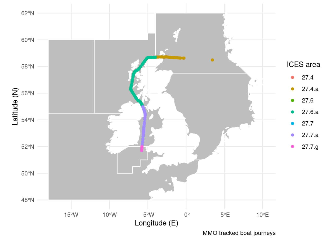
3.3.0.4 Polygonising
raster ⇢ polygons
If you have a qualitative raster (say of 5 habitat types) you may want to merge identical cells into a single shape. This also opens the door to point in polygon analysis like above. There are also functions which let you sample points from a raster directly, but you won’t have the polygon for other uses. For the example below I’ve rounded the distance to shore dataset to the nearest 1000 km. This gives us three bands of distance we can condense into three shapes. I’ve made the boundaries for the polygons white to “prove” to you that the cells have merged into a single polygon.
library(stars)

distance <- round(distance_to_shore_crop, -3) %>%             # Round distance to shore to the nearest 1000km
  st_as_stars() %>%                                           # convert to stars object (intermediate step)
  st_as_sf(merge = TRUE, as_points = FALSE)                   # Merge cells with the same value to an sf polygon

ggplot(distance) +                                            # Start the plot
  geom_sf(aes(fill = layer), colour = "white") +              # Add the polygons
  theme_minimal() +                                           # Use an aesthetic template
  labs(x = "Longitude (E)", y = "Latitude (N)",               # Add labels
       fill = "Distance",
       caption = "Distance from shore (nearest 1000 km)")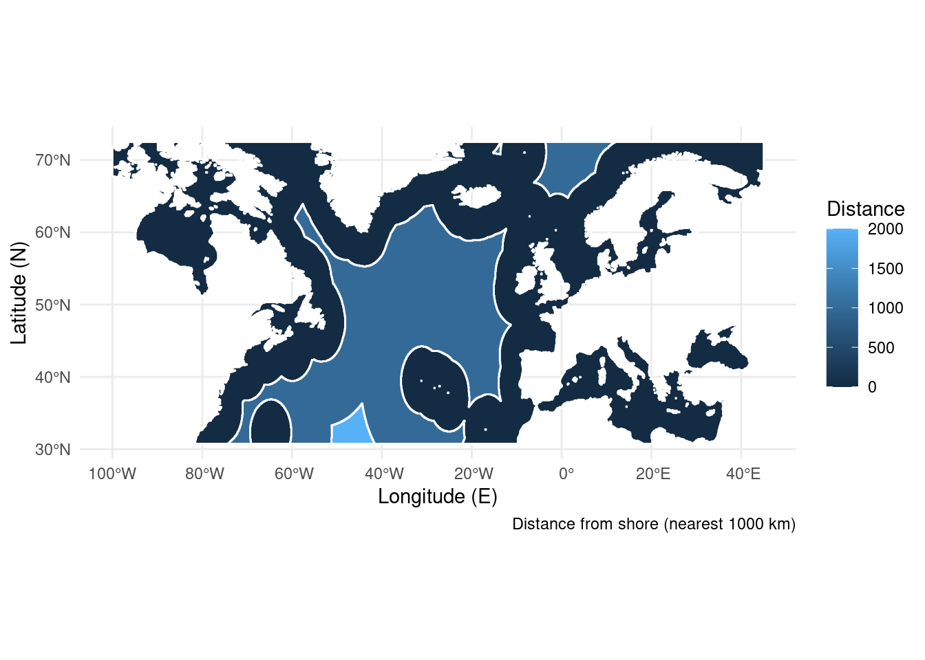
3.3.0.5 And much more
You can find a whole list of geocomputation functions documented online here.